.jpg)
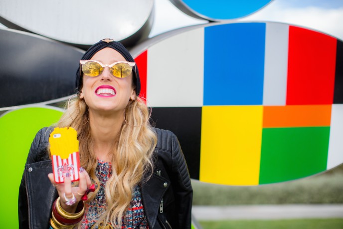
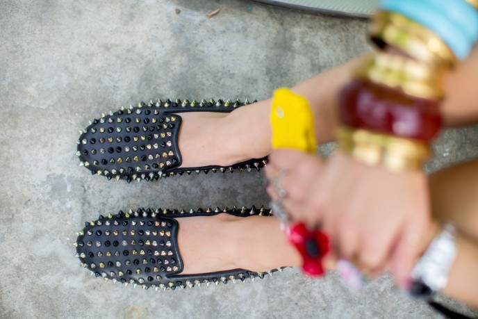
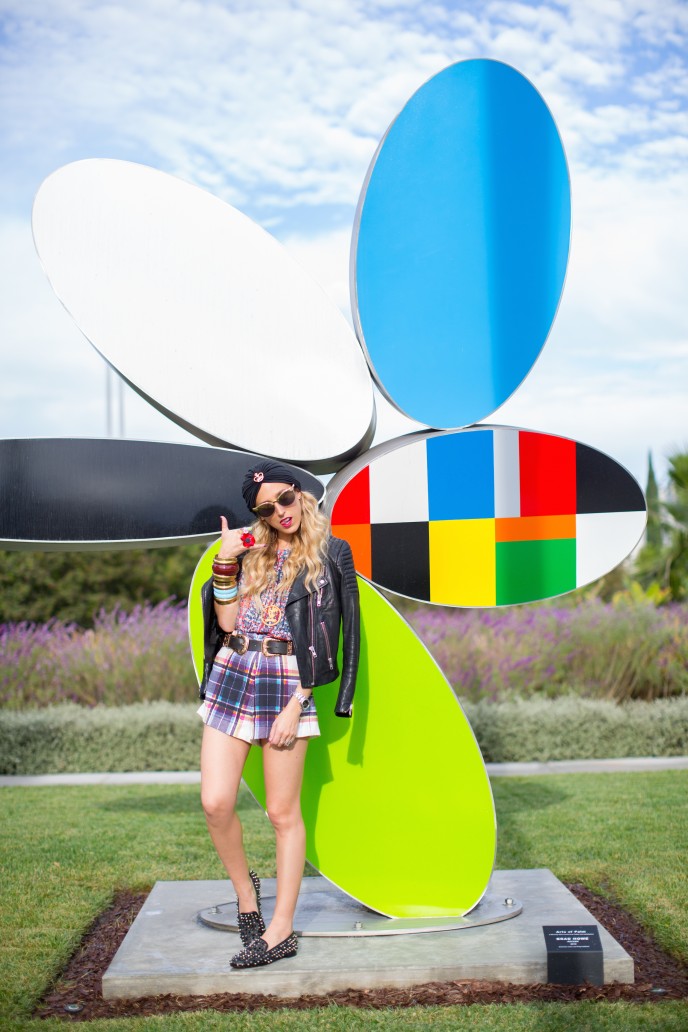
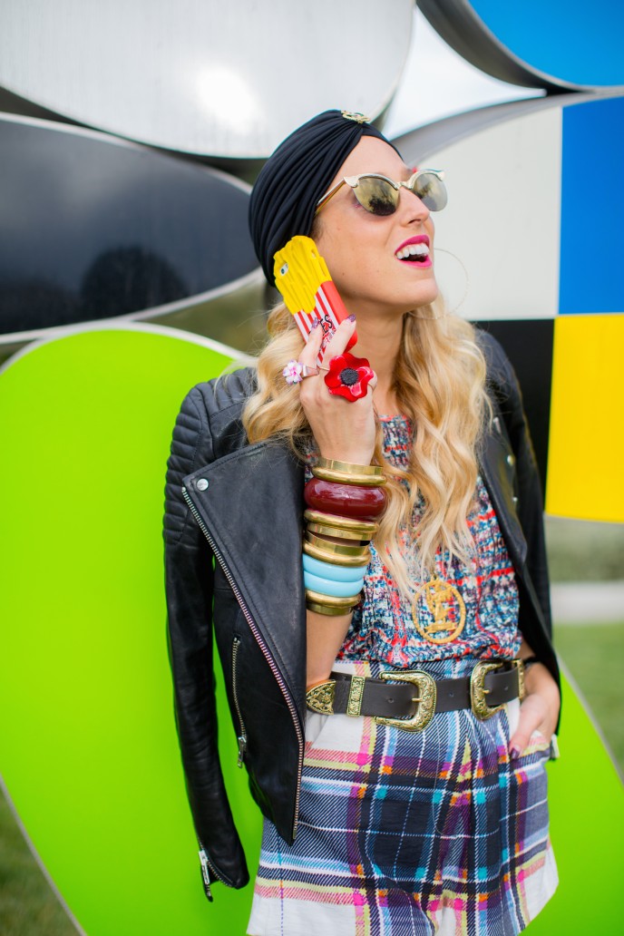
I crave color like Paris Hilton craves a #selfie on set of a music video. Bring it on-- more, more, more!
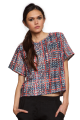
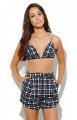
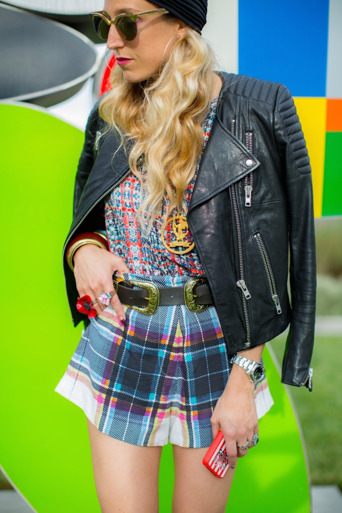
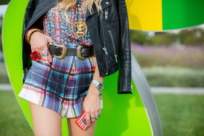
It's always been easy for me to pair wild prints together-- actually not much thought goes into the process. I find two prints that I like, and it usually works. In this case, I'd categorize both of these prints as "digi-square" {digital square} because they both look like they could have been brick walls straight out of a Mario Bros-esque video game in their past lives. In deepest conclusion, this commonality in print character makes them mesh well together.
If I could offer one tip on mixing prints, it'd be this... (continue reading)...
Photography by Sabrina Hill
.jpg)
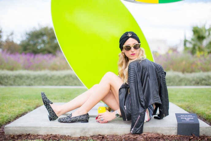
Find two prints that have the same flow-- be it both white backgrounds, both similar colorways, or both similar genres (floral on floral, stripe on stripe). Common elements in prints make it easier for the eyes to adjust from one fabrication to the next.
Start slow... try pairing a printed tee with a printed mini skirt. Less fabrication means less room for mistakes ;). Share your print on print lewks with me on instagram by tagging @elshanesworld to get my attention! Promise I'll comment and tell you why I love it or hate it. ;)